Plotting a referendum
Following the shock decision by the UK to leave the EU, many ideas were put forward as to the reasons behind why so many people voted the ways that they did.
In an effort to learn more about data handling in python, using pandas, matplotlib and other fun stuff I scoured the internet for data and set about plotting graphs.
Referendum results
The election was different to all others that I am aware of in England. Every votes counted individually; at the end of the day the result was decided on precisely how many people had voted each way. None of the usual first-past-the-post, regional representation. As such the paper’s and broadcaster’s usual elections maps faced a problem. They had all been designed to colour each region by what party had won. In the referendum that didn’t matter so much as the number of votes each way.

Many places chose to separate the map into 4 colours: solid wins for each side and narrow wins for each side, with narrow usually meaning a 5% or 10% lead. So Newcastle with a vote of 50.70% remain and 49.30% leave is coloured as remain winning, even though there were fewer than two thousand votes between them.
The turnout for the election was high, at around 74% on average. The smallest turnout came form the cities of Glasgow, London and Manchester. London in particular showed a surprisingly low turnout across the area, which may have changed the result as London proved to be significantly in favour of remaining within the EU.

Looking at the data, the turnout itself had very little relation to how each area voted in the referendum.

Correlations
Shortly after the election results were counted, all manner of explanations were given as to why the country voted the way it did, for example “old people voted to leave”, “people in poverty didn’t see how leaving could make anything worse for them”, “turnout among young people was small”.
In the following I aim to compare a few of the possible factors in the way population voted. This is clearly a hugely complicated issue and encompasses many different factors, so this is look at a tiny cross-section of all this.
Income
London primarily voted to remain in the EU and typically has some of the highest median salaries across the country. As such you might expect some relation between income and referendum results.

The distribution of incomes over the country shows the concentration of money in and around London, with a surprising second place going to Copeland, in Cumbria, possibly because of the nuclear plant at Sellafield.

Comparing the median income of an area with how it voted shows a fairly convincing relationship; those who earn more tended to vote to remain. However, as the incomes are also highly related to being in London, perhaps this isn’t the most useful comparison.
Unemployment

There is a higher proportion of unemployment in and around cities in the north, with large numbers in Middlesborough, Birmingham and Glasgow.

This did not translate into any significant preference when voting in the EU referendum. It could be argued that there is a small preference for places with high unemployment to vote to leave the EU, but the data points look fairly evenly spread.

Perhaps the most convincing relationship apparent in all this data is that areas with higher unemployment had a significantly lower turnout than those areas with lower unemployment.
CAP Spending
At the time of the vote there was a feeling that many of the regions which benefit the most from EU spending had in fact voted to leave, and so stop receiving this spending. The majority of EU spending comes in two forms: the CAP and the European Structural and Investment Funds. The EU requires that all CAP expenditure is freely available, so we consider that here.
The CAP (Common Agricultural Policy) is responsible for a large proportion of the UK’s spending of EU money, bringing in around £4bn each year. Roughly speaking, it provides subsidies for landowners with agricultural land.

As such, one would expect that CAP spending would be related to the amount of land in each region. This can be seen to some extent on the map, with the most spending evident in rural Scotland and Wales.
However when compared to the votes cast in the EU referendum, the amount of CAP spending seems to make little difference.

A slightly more pronounced effect is seen when restricted to looking only at money spent from the rural development fund.

However, both these datasets suffer from having such a wide range of values that little can be inferred from this and the graph might be misleading. Even when plotted with a logarithmic scale no trends can be seen.

It would be more interesting to also study the ESIF spending in rural areas. These structural and investment projects may have more of an effect on a local area than the CAP which ultimately is paid only to the landowners. In the period 2014-2020, the UK was expected to receive around £10.8bn for the ESIF (see Vince Cable’s letter).
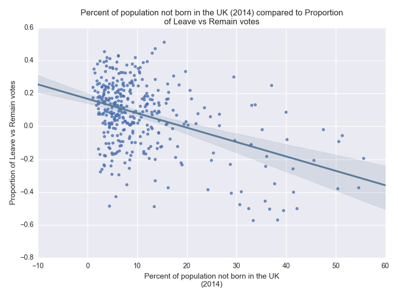
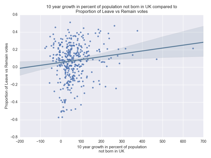
Immigration
Immigration was widely touted as the reason many voted to leave the EU. By leaving, we were told, the UK could regain control over its borders and prevent the free movement of labour. This free movement has frequently been criticized, backed by the popular mantra that immigrants are stealing jobs and claiming benefits, even though it has been shown that overall immigrants to the UK tend to be a net gain for the economy (see Guardian or FT on research from UCL).
None of the data I considered looked at only EU immigrants. This could skew any results, as the vote was at most about restricting EU immigration, however it could be argued that those most against immigration wouldn’t care too much about where immigrants come from.
There are two main aspects of immigration considered below:
- The proportion of immigrants in the local population
- The growth in this proportion over 10 years


Both seem to have different, but fairly small effects on how a region voted in the referendum. Those more diverse areas, where the proportion of immigrants is higher, tended to vote more strongly to remain in the EU. On the other hand, those areas where the proportion of immigrants has grown most rapidly were more inclined to vote to leave the EU.